
Piet Zwart
auteur
Piet Zwart was een zeer invloedrijke Nederlandse grafisch ontwerper, typograaf en fotograaf. Hij wordt beschouwd als een pionier van de 'New Typography', een stijl die de nadruk legde op helderheid, geometrische structuren en het functionele gebruik van letters. Zwart werkte voor verschillende belangrijke publicaties, waaronder het tijdschrift 'Deelicht', en zijn ontwerpen stonden centraal in de modernistische beweging in Nederland. Hij was ook een actieve deelnemer aan de New Photography-beweging, die fotografie wilde gebruiken als instrument voor moderne expressie en sociale documentatie.[1]
- New Typography
- modernisme
- grafisch ontwerp
- fotografie
Piet Zwart: Typography, Photography, and the Designed Public Sphere
A sourced account of Piet Zwart’s interwar practice across typography, photomontage, industrial design, and photography, with particular attention to his 1938 PTT book.
Piet Zwart (1885–1977) matters to photobook and design history not because his practice can be reduced to a single medium, but because he made typography, photography, and industrial communication operate as one visual system. The Getty Research Institute’s Union List of Artist Names identifies him as a Dutch photographer and designer, records Zaandijk as his birthplace and Leidschendam as his place of death, and gives his professional activity as 1919–1977 (Getty ULAN). That controlled record also preserves the breadth of his roles—architect, graphic designer, photographer, typographer, teacher, and industrial designer—an essential corrective to accounts that isolate him as merely a maker of advertisements.
From architecture to the graphic field
Zwart’s early formation in architecture remained active in his printed work. Cooper Hewitt notes his training at Amsterdam’s School of Applied Arts, his employment with Jan Wils and later Hendrik P. Berlage, and the importance of De Stijl, Russian Constructivism, and Dada to the development of his practice (Cooper Hewitt). Its account is especially valuable because it specifies that he began his graphic-design and typographic career by 1923 while still working in Berlage’s office. The page does not present modernism as a style adopted wholesale: it observes that Zwart rejected De Stijl’s strict symmetry and orthogonality while retaining its abstract, linear, and geometric resources.
The result was a compositional method rather than a decorative signature. Cooper Hewitt describes his use of primary shapes and colours, mixed typefaces, diagonals, asymmetry, repetition, and visual puns; it also records his self-description as a “typotect,” joining typographer to architect (Cooper Hewitt). The term usefully names the structural ambition of these pages: language is not simply set on a surface but built into a spatial arrangement.
Photography inside a design practice
Photography was central to that arrangement. The ULAN record states that Zwart experimented with photograms from 1923, was introduced to photomontage by El Lissitzky in 1926, and from 1928 worked freelance as a photographer and graphic designer in Delft, Rotterdam, and The Hague (Getty ULAN). Cooper Hewitt likewise dates the incorporation of photomontage into his compositions to 1926, emphasizing the contrast it produced between type and photographic image (Cooper Hewitt).
The International Center of Photography places this technical development in an international network. Its archive describes the shift from Arts-and-Crafts-inflected beginnings under the impact of De Stijl, Zwart’s contacts with Kurt Schwitters, El Lissitzky, and Jan Tschichold, and his adoption of a modernist language joining photomontage to Constructivist geometry (International Center of Photography). It also links his work in the 1920s and 1930s to commissions for NKF and PTT and notes his participation in the Circle of New Advertising Designers. For specialists, this makes clear that his photographs should be read not as an autonomous late diversion but as images generated within a wider project of communication, reproduction, and public address.
Het boek van PTT as a synthesis
Het boek van PTT (1938) is a key object for understanding the relation between Zwart’s photographic and typographic concerns. The Metropolitan Museum of Art identifies the work as edited by Zwart, dated 1938 and associated with Leiden; its Watson Library record describes a 49-page illustrated volume, chiefly in colour (The Met). The Art Institute of Chicago independently records the same 1938 work as a book with colour lithographs and photocollage wrappers, naming Zwart as editor (Art Institute of Chicago).
Those institutional records establish the edition-level facts without requiring conjecture about an individual copy: this is a 1938 Dutch book associated with Leiden whose object descriptions foreground colour lithography and photocollage. Its significance lies in the way it condenses Zwart’s practice. Here the book is not a neutral container for information. Photography, printing, typography, and wrapper become coordinated instruments of visual instruction and public communication.
After the interwar period
Zwart’s range continued beyond the printed page. Cooper Hewitt records his work for the Nederlandsche Kabelfabriek through 1933 and his subsequent commissions for Bruynzeel, including advertising, packaging, interiors, and a prefabricated modular kitchen mass-produced for the Dutch market from 1938 (Cooper Hewitt). The Getty Museum similarly notes his work for PTT across stamps and exhibition stands, his lectures at the Bauhaus in Dessau, and his continued photographic investigation through the 1940s (Getty Museum).
Zwart therefore occupies a distinctive position in twentieth-century visual culture: a maker for whom industrial production, photographic experiment, typographic construction, and the social circulation of information were mutually enabling. The PTT book is not incidental to that position. It is one of the clearest surviving book forms through which his “typotect” conception can be studied.
Sources
Boeken
-
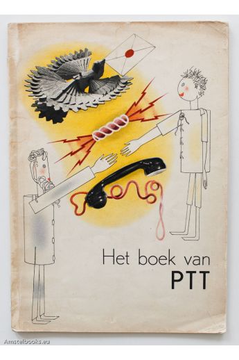 Het boek van PTT€ 1.400,00
 -
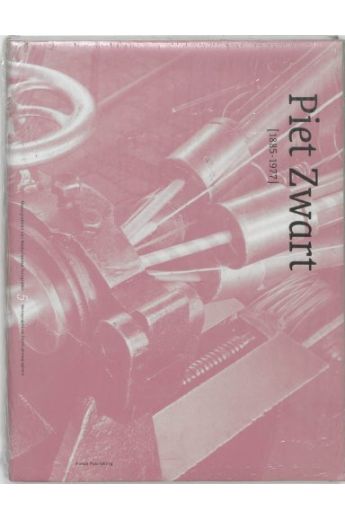 Piet Zwart 1885 - 1977€ 15,00
 -
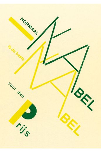 Reclame€ 13,00


Werk van Piet Zwart
- 1940 Waar Nederland trotsch op is Contributor to visual design.
Referenties
- Piet Zwart. Waar Nederland trotsch op is. A.W. Sijthoff's. 1940